Why 300+ Businesses Trust Our Responsive Designs
📱 Mobile-First Certified
⚡ 100% Responsive
🚀 7-Day Delivery
Imagine this: a potential customer searches for your business on their phone. They click your link, but the text is tiny, buttons are impossible to tap, and images are cut off. They leave in 3 seconds — and go to your competitor.
This scenario plays out millions of times every day. In 2026, responsive web design isn't optional — it's mandatory. Google's mobile-first indexing means your mobile site determines your rankings. AI-driven user experience (UX) algorithms punish non-responsive sites. And most importantly, 63% of all web traffic now comes from mobile devices.
At AzienBiz, we've built over 300 responsive websites for businesses across the USA and Canada. In this complete guide, we'll show you exactly why responsive design is non-negotiable in 2026, backed by data, case studies, and actionable insights.
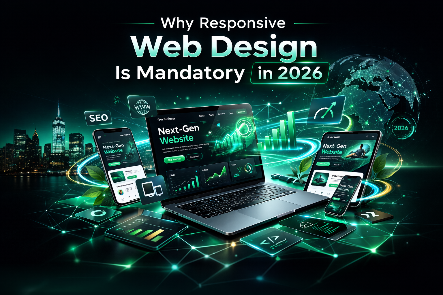
📱 What Is Responsive Web Design?
Responsive web design is an approach where a website automatically adjusts its layout, images, and functionality to look perfect on any device — desktop, tablet, or mobile. It uses:
- Fluid grids – Layouts that scale proportionally.
- Flexible images – Images that resize within their containers.
- CSS media queries – Different styles for different screen sizes.
In short: one website, every device, perfect experience.
🔍 Mobile-First Indexing: Google's Game Changer
Since 2019, Google has used mobile-first indexing for all new websites. In 2026, this is fully enforced. What does this mean?
Google primarily uses the mobile version of your website for indexing and ranking. If your mobile site is slow, hard to navigate, or missing content, your rankings will suffer — even if your desktop site is perfect.
70%
of Google's crawls are mobile
#1
Mobile-friendliness is a top ranking factor
53%
of mobile users leave if a site takes >3 seconds
How to Check If You're Mobile-Friendly:
Use Google's Mobile-Friendly Test. Or contact us for a free audit.
🤖 AI-Driven UX: The New Ranking Factor
Google's AI (RankBrain, BERT, and newer algorithms) now analyzes how users interact with your site. It measures:
- Bounce rate – Do users leave immediately?
- Time on site – Do they stay and engage?
- Click-through rates – Do they find what they need?
- Tap targets – Are buttons easy to tap on mobile?
If your site isn't responsive, AI detects poor UX and signals Google to rank you lower. Responsive design = positive AI signals = higher rankings.
📊 Shocking Statistics You Need to Know
63%
of all web traffic is mobile
57%
won't recommend a business with a bad mobile site
80%
of users delete an app after one bad experience
3x
higher conversion rates on responsive sites
50%
of users say they'll never return to a non-mobile-friendly site
2x
more time spent on responsive sites
📈 SEO Impact of Responsive Design
Responsive design directly affects these SEO factors:
- Page speed – Google's Core Web Vitals prioritize fast-loading mobile pages.
- Duplicate content – Separate mobile sites (m.example.com) create duplicate content issues.
- Backlinks – All backlinks point to one URL, consolidating authority.
- User engagement – Lower bounce rates signal quality to Google.
Responsive vs Separate Mobile Site
| Factor | Responsive Design | Separate Mobile Site |
|---|
| URL Structure | One URL for all devices | m.example.com |
| Maintenance | One site to update | Two sites to maintain |
| SEO Authority | Consolidated backlinks | Split authority |
| Duplicate Content | None | High risk |
| Google Preference | ✅ Recommended | ⚠️ Allowed but not preferred |
💰 Conversions & User Trust
A responsive website isn't just about rankings — it's about money. Studies show:
- Mobile users are 5x more likely to abandon a non-responsive site.
- 79% of shoppers who have trouble with a mobile site are less likely to buy again.
- Responsive design can increase conversions by up to 200%.
Trust is built through seamless experiences. If your site looks broken on a phone, customers assume your business is also broken.
💸 The Cost of NOT Having a Responsive Website
Let's do the math:
- Lost traffic: If 63% of users are mobile and your site isn't responsive, you lose 63% of potential visitors.
- Lost rankings: Google penalizes non-mobile sites. You drop to page 2, 3, or worse.
- Lost revenue: If you make $10,000/month from your site, that's $6,300/month lost.
- Annual loss: Over $75,000 per year — all because your site isn't responsive.
A responsive website from AzienBiz costs as little as $300 one-time. The ROI is massive.
📈 Real Results: Before & After Responsive Design
Case Study 1: Chicago Dental Clinic
Before: Non-responsive site. 40% mobile traffic, 80% bounce rate on mobile.
After (AzienBiz): Fully responsive redesign. Mobile bounce rate dropped to 35%. Mobile traffic increased to 60%. Appointments up 150%.
Case Study 2: Toronto E-commerce Store
Before: Separate mobile site (m.example.com). Duplicate content issues, slow loading.
After (AzienBiz): Responsive design, one URL. Page speed improved 40%. Organic traffic increased 120%. Sales up 80%.
Case Study 3: Miami Restaurant
Before: Desktop-only site. Mobile users couldn't view menu or book.
After (AzienBiz): Responsive site with mobile-friendly menu and booking. Mobile reservations increased 200%.
💰 Responsive Website Pricing (2026)
Starter
$300 one-time
- 3 responsive pages
- Mobile-optimized images
- Touch-friendly buttons
- Basic SEO
Business
$500 one-time
- 5 responsive pages + blog
- Flexible grids
- Mobile navigation
- Local SEO
Professional
$800+ one-time
- 10+ responsive pages
- Custom responsive design
- Advanced UX optimization
- Core Web Vitals optimized
❓ Frequently Asked Questions
What is responsive web design?
Responsive web design is an approach where a website automatically adjusts its layout, images, and functionality to look perfect on any device — desktop, tablet, or mobile. It uses flexible grids, CSS media queries, and responsive images.
Why is responsive design mandatory in 2026?
Because Google uses mobile-first indexing, meaning it primarily uses the mobile version of your site for ranking. Additionally, over 60% of web traffic comes from mobile devices, and AI-driven UX expects seamless experiences across all screens.
How does responsive design affect SEO?
Responsive design directly impacts SEO because Google rewards mobile-friendly sites with higher rankings. It also reduces bounce rates, increases time on site, and improves page speed — all ranking factors.
What is mobile-first indexing?
Mobile-first indexing means Google primarily uses the mobile version of your website for indexing and ranking. If your site isn't mobile-friendly, it will rank lower, regardless of desktop performance.
How does AI-driven UX relate to responsive design?
AI-driven UX analyzes how users interact with your site across devices. If your site isn't responsive, AI detects poor user experience and signals Google to rank you lower. Responsive design ensures AI sees positive engagement.
Can I have a separate mobile site instead of responsive design?
Technically yes, but it's not recommended. Separate mobile sites (m.example.com) create duplicate content issues, require more maintenance, and often have slower performance. Responsive design is Google's preferred method.
How much does a responsive website cost?
At AzienBiz, responsive websites start at $300 for a starter site and go up to $1200 for custom designs. All are one-time payments with no monthly fees.
How do I know if my site is responsive?
You can use Google's Mobile-Friendly Test tool. Simply enter your URL, and it will tell you if your site is mobile-friendly. We also offer free site audits.

About AzienBiz
AzienBiz has built over 300 responsive websites for U.S. and Canadian businesses. We specialize in mobile-first design that ranks on Google and converts visitors into customers. All our sites are one-time payment, no monthly fees.
📞 +92 334 8743301 | ✉️ azienbiz@gmail.com